New world maps
Here are some new versions of the world map that we are used to seeing that might help us to get a fresh perspective on the way things are, and the way they are shown to us. In these maps, the square area of continents/regions corresponds to their proportion of conflict death tolls and of media coverage. Let’s start with some maps representing conflict death tolls, and follow with some maps representing media coverage. The media coverage maps are for the year 2000 for CNN, BBC, the New York Times, Le Monde and the Yomiuri newspapers.
Map of conflict-related deaths (1990-1999)
(What’s the big continent in the middle? Africa? That’s odd, we so rarely seem to hear about it…)
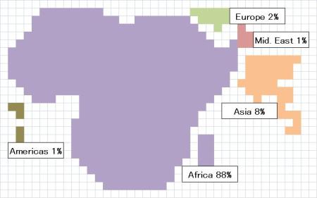
Map of conflict-related deaths (1990-2007)
(Note the relative growth in conflict deaths in the Middle East since 2000 – that’s the war in Iraq. The Middle East is still totally dwarfed by Africa, though, as is the rest of the world’s conflict).
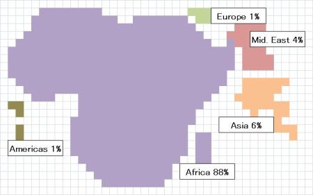
The world according to CNN (2000)
(Coverage of the Middle East is more than double that of Africa)
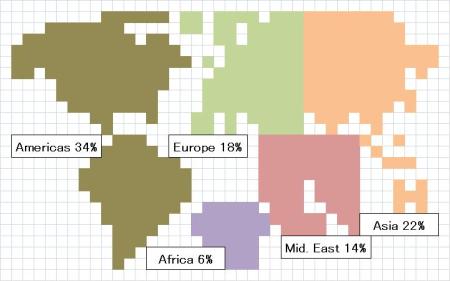
The world according to BBC (2000)
(A little more on Africa than CNN, but that continent still looks pretty small)
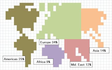
The world according to the New York Times (2000)
(This does not include domestic news – news about the USA)
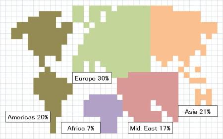
The world according to Le Monde (2000)
(This does not include domestic news – news about France)
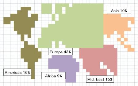
The world according to Yomiuri (2000)
(This does not include domestic news – news about Japan)
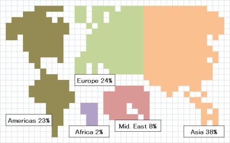
Notes and disclaimers
Data is organized according to five continents/regions of the world: Africa, the Americas, Asia, Europe and the Middle East. In the conflict maps, the square area of each continent/region is proportionate to that continent/region’s percentage of the world’s total conflict-related death toll. There is no detail beyond that, so although Madagascar appears on the death toll maps, it is only there because it geographically represents a part of Africa (there were no conflict-related deaths recorded for Madagascar).
In the media maps, the square area of each continent/region is proportionate to that continent/region’s percentage of the coverage by each media corporation. As with the conflict maps, there is no detail beyond the continent/region as whole, so the shape of the Americas (no distinction is made between north, south or central), for example, was made roughly according to geographic scale and does not represent any internal proportion in news coverage. In the case of the maps for newspapers, the coverage is limited only to the international news on the front page and international pages – home/local news is not included. It should also be noted that the percentages for the media maps do not add up to 100 percent because a certain percentage of media coverage could not be categorized according to geographical location – coverage of global issues or United Nations conferences, for example.
Displaying these maps together here is not to suggest that levels of media coverage should be proportionate to the numbers of conflict deaths. Conflict-related events are not the only issues that become the source of international news stories. Furthermore, it is unrealistic to expect that the sheer scale of a conflict (death toll) will be the only factor considered in determining news coverage – although it should certainly be one of the major factors (alas, it is not).
It should also be noted that the timeframe of analysis is quite different. The death toll maps are based on cumulative data of death tolls since the end of the Cold War, while media maps are one-year snapshots of coverage – in this case, the year 2000. A number of the conflicts that make up the cumulative death tolls in the maps were not ongoing in the year 2000. By the same token, it should also come as no surprise that the deadliest conflicts of the year 2000 were occurring in Africa – the Democratic Republic of Congo (DRC), Angola, Ethiopia-Eritrea and Sierra Leone. It is also critical to note that it was in the year 2000 when it became known (through a survey conducted by the International Rescue Committee (IRC)) that conflict in the DRC had claimed 1.7 million lives, making it by far the deadliest conflict in the post-Cold War world. This revelation didn’t seem to have any impact on media coverage.
Sources
Death toll data is generally very unreliable, as has been mentioned in a previous post. That shouldn’t stop us from trying. The sources for the death tolls in this map are from my book, but before they arrived there came from a multitude of sources, including projects and institutions that try to record, measure and compare death toll figures, epidemiological surveys, and sometimes the media. Where there are conflicting studies/records for death tolls, compromises have been made in some cases. None is more controversial than in that in the case of Iraq. The death toll for Iraq used here is a very conservative 400,000. Some death toll figures now are reaching the 1 million mark.
The sources for the media coverage maps are from a study I conducted some years ago of news coverage in the year 2000. I measured the square area of each international news article (including photos) for three newspapers (the New York Times (USA), Le Monde (France) and the Yomiuri (Japan)) each day for one year. I also measured the length (in seconds) of each news story for one 30-minute news program each day for CNN International and BBC. I wish I could provide more recent data, but this kind of study takes a huge amount of time to conduct and I have yet to find that kind of time to do a similar study. More results from the study (and analysis) can be found in an article I later published: Hawkins, Virgil ‘The Other Side of the CNN Factor: the media and conflict’, Journalism Studies, Vol. 3, No. 2, 2002, pp. 225-240.


31 December, 2008 at 4:15 am
Excellent work, Doc.
31 December, 2008 at 9:20 am
Virgil,
Your book and this blog wonder about “how the world’s worst violence is ignored.”
I propose one other reason why that might be. Because our valiant press corps “a rotating team of national staff reporters,” shlubs around with Barack Obama (or any other president, elect or otherwise) and reports crap like this:
At 3:12 p.m. Obama could be seen by the pool putting on the ninth hole. After one practice swing, Obama took his putt from the tee-box side of the cup and twisted his body wildly in the direction of the cup after connecting with the ball. Obama missed, and moved to line up his next shot. He missed that from the backside of the hole but then tapped in immediately after his shot fell short. Obama then drove his cart up to the snack bar located between the ninth hole and the 10th hole tee-box. He got out of the cart and walked up to a group of about 20 golfers who had gathered behind a barricade of green plastic chairs and agents with the U.S. Secret Service. The pool was standing on the green behind the 18th hole and could not see Obama or hear what he said to the group. Obama then walked down to the snack bar located next to the tee-box on the 10th hole. There he paid $1.88 for an Aloha Maid Natural Green Tea with Ginseng can, according to
attendant Myrna Gunderson. A member of Obama’s entourage then bought three half sandwiches for $2.83 each. Gunderson handed Obama a ham and cheese sandwich. After placing his order in his golf cart, Obama walked out to the 10th tee with his driver in his right hand. He looked up to an area off the 18th hole where a crowd of onlookers was gathered and waved. After two practice swings, Obama connected on a shot then went straight. At 3:24 p.m. Obama drove off to the fairway and the pool returned to the clubhouse.
That was a report filed by Peter Boylan, “reporter” with the Obama Transition team press office, which is a squad of national reporters that is “camped out in front of Obama’s vacation home.” Obama doesn’t really want them there, but these intrepid folks somehow see it their first amendment duty to offer the public reporting of such stultifying banality, one wonders what real news is never recorded. We know news media have limited resources, now more than ever. And this is on what a good deal of effort is being spent. Zero sum game has never looked so much like zero is winning as with the jokers who currently inhabit the national press corps.
[excerpt from Steven Rosenfeld, from Alternet.org]
31 December, 2008 at 1:47 pm
[…] maybe a way to publish materials that did not make it into the book). For instance, compare these two maps which neatly illustrate the issue of ‘chosen’ versus ’stealth’ […]
31 December, 2008 at 6:28 pm
Ken, I agree. Incredible – golf exploits and a half ham and cheese sandwich for $2.83, that’s news?… In fact in my book I touch a little on the media’s closeness with their domestic policymakers as a part of the reason for the bandwagon effect and the production of news that is straight from the mouths and agendas of the policymaker. This kind of reporting of ‘stultifying banality’ is indeed frustrating. But what is a little more in the direction of frightening is examples of an even closer media and policymaker marriage (literally). During the war over Kosovo, the leading foreign correspondent for CNN (Christiane Amanpour) was covering Kosovo at the same time as her husband was spokesman for the US State Department (James Rubin). Frightening… No wonder some are calling the US press a “semi-independent” press…
1 January, 2009 at 1:06 am
Virgil,
A local singer here has a great song about this I think you’d enjoy.
Caleb Stein and the Brakemen,
From the Tongues of Kings
Have a listen. I think you’ll enjoy it.
4 January, 2009 at 3:35 pm
Thanks for that, Ken. Great lyrics. “Common thought is the ruler’s pen”. Yes indeed!
29 January, 2009 at 10:00 am
I was really blown away by your post. I would definitely love to see more of these types of things.
6 February, 2009 at 3:23 pm
[…] the number of conflict related deaths and the amount of time given to these conflicts by the media. Hawkins rightly points out that conflict related deaths are not the only factors we should give to levels of media […]
9 February, 2009 at 7:33 am
[…] conflicts are in Africa. (and yet the media coverage is inversely proportional as you can see on these maps prepared by […]
17 October, 2009 at 11:55 am
Interesting information, just what i was looking for. Thanks
I was also looking to see those figures compared to peaceful places. I would like to know who violent the earth really is.
29 October, 2009 at 11:51 pm
[…] Virgil Hawkins does a good job pointing out the pretty obvious and pure discrepancy in between media coverage and death tolls per region, highliting the fact that African conflicts are responsible for 88% of the death toll from all […]
6 January, 2010 at 1:46 am
[…] Virgil Hawkins, New World Maps, Stealth Conflicts, December 30, […]
16 July, 2010 at 1:26 am
The Wisdom of Crowds and the Irrationality of Mobs…
Homo sapiens is Latin for “wise man” or “knowing man”; it is often used synonymously as “thinking man” and has been misunderstood to mean “rational man” in the collective imagination. We imagine ourselves to be rational; the idea that unconscio…
27 February, 2011 at 10:12 am
My partner and I stumbled over here different website and thought I may as well check things out. I like what I see so now i am following you. Look forward to finding out about your web page for a second time.
9 March, 2011 at 7:42 am
Hello! This is my 1st comment here so I just wanted to give a quick shout out and tell you I really enjoy reading your articles. Can you recommend any other blogs/websites/forums that deal with the same subjects? Thank you!
8 October, 2011 at 6:06 am
Hmm I find this a bit disturbing. World maps are changing, thats for sure.
vet verbranden
13 February, 2012 at 10:09 pm
The death toll status must be significantly higher nowadays. I wonder where the world is going to. I hope you’ll update this site soon so we can see…
14 March, 2012 at 4:12 am
Looking at these maps it clear to me that there is a problem here. A lot of things are happening in Africa yet no one is covering it. People around the world should at least know what is going on in the world. That does not mean just the U.S., Europe, Asia, and the Middle East as it seems these are the areas that get the most coverage. It’s a problem that Africa does not even break the the double digits on how much coverage is covered there.
27 March, 2012 at 12:56 pm
daily news…
[…]New world maps «[…]…
9 July, 2012 at 12:27 am
[…] Virgil Hawkins, New World Maps, Stealth Conflicts, December 30, […]
22 July, 2012 at 4:51 am
Nice Maps 🙂
13 January, 2013 at 6:39 am
Pritty impressive
7 July, 2014 at 9:23 am
Information great writeup. It actually was as soon as a fun consideration the item. Look intricate to significantly introduced gratifying from you! Mind you, the best way could we communicate?
15 April, 2016 at 3:10 am
[…] [viii]Hawkins, V. (2008). New world maps. Retrieved March 31, 2016, from https://stealthconflicts.wordpress.com/2008/12/30/new-world-maps/ […]
18 October, 2016 at 1:53 pm
So what is the rate of DDR in the world by continent?